
Simple, Stupid
 The Fifth Unbreakable Rule is Simplicity. And I wanted to take the time to celebrate some examples of extremely simple campaigns and individual ads that illustrate this principle elegantly. I know that most of my posts are sarcastic and negative–mostly because that’s what entertains people. But I’m obeying a court order that requires me to do a positive post occasionally to balance out all the negativism.
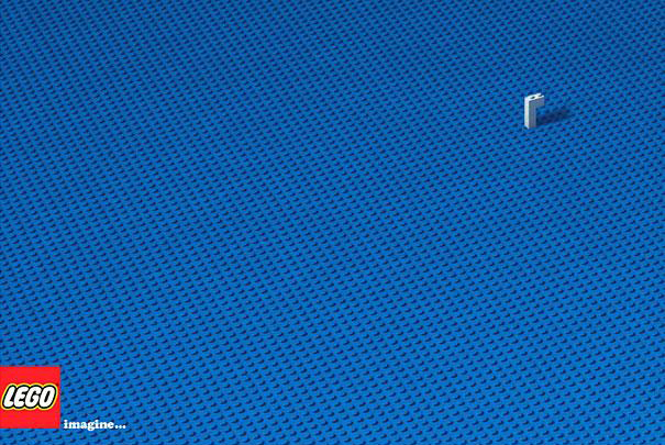
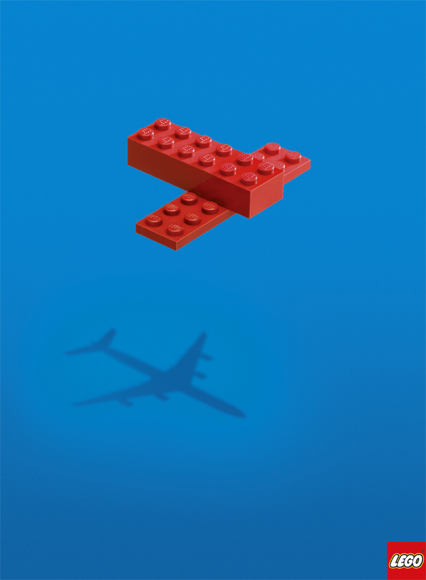
Many of you, especially in the creative side of the ad business, have probably already seen these two print campaigns for Lego. The first is so simple and yet so eloquent in the ultimate benefit of the product that it literally needs no words. So I won’t use any.
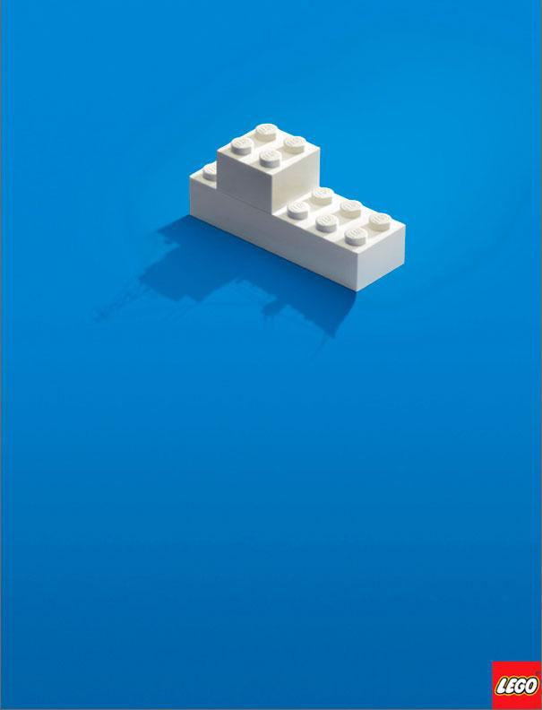
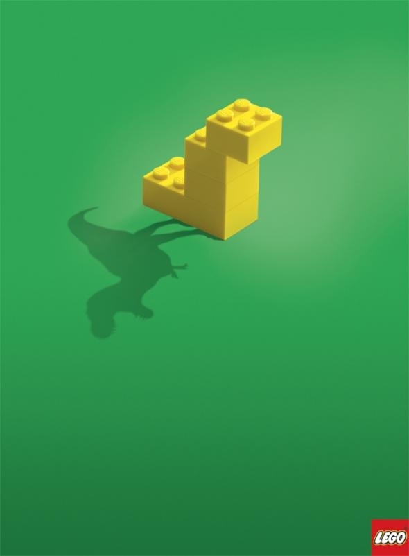
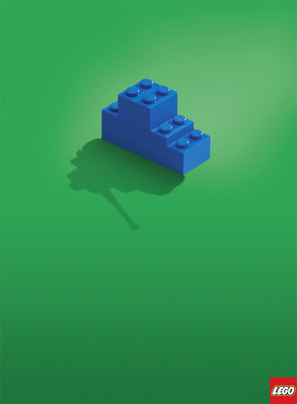
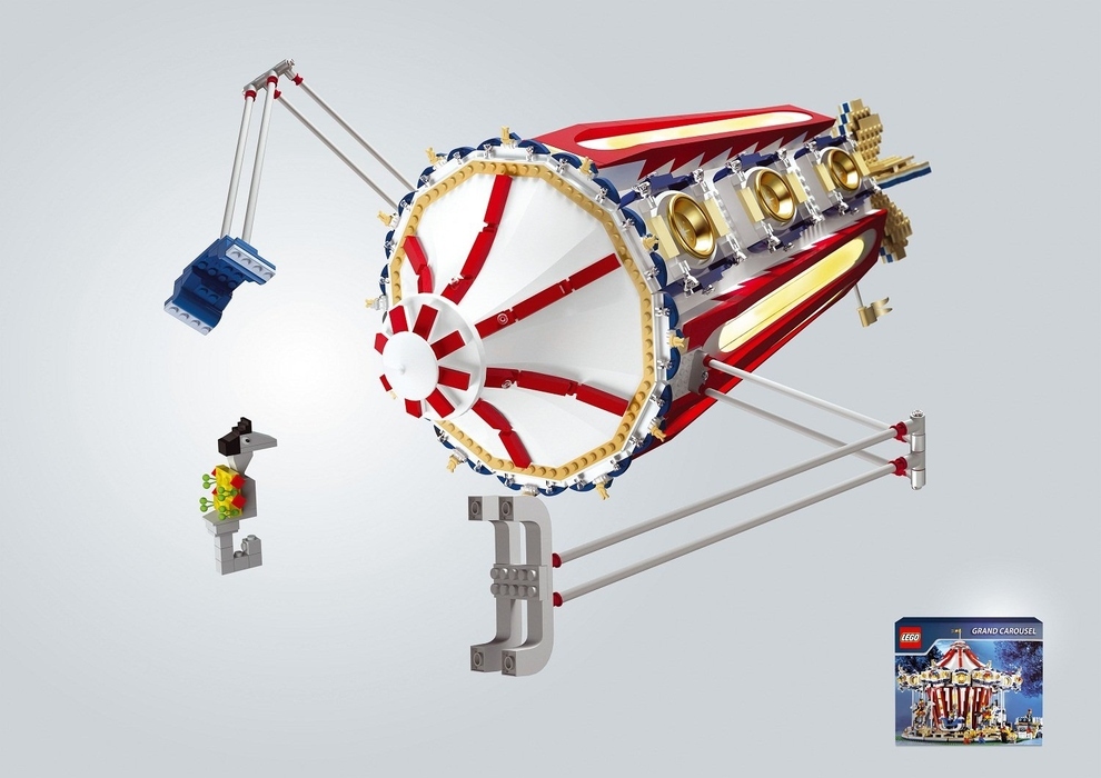
The second campaign, done a couple of years ago by Leo Burnett in Moscow, is equally simple and just as emotionally evocative. It shows the cover of the kit box in a small inset—what the Lego kit is intended to build—but the main image shows what else you could do with it. I can’t imagine a toy from Mattel giving the purchaser such license; “No, this is how it’s supposed to look, so don’t dare try anything creative.”

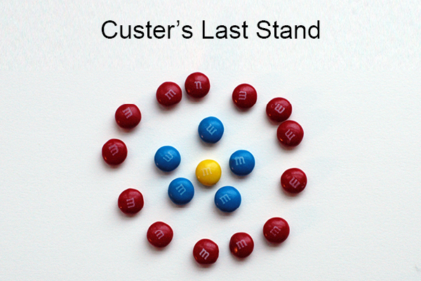
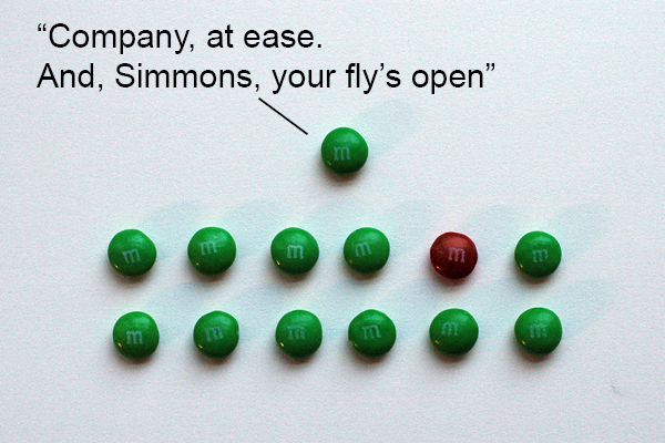
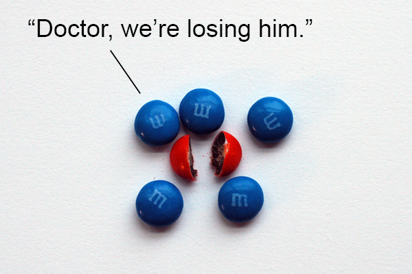
 It brings back my own childhood, when I used to use Lego blocks to build all sorts of ships, submarines, siege engines, castles, forts, particle accelerators, lunar landers, and time machines. My imagination was so febrile I’d use a ball point pen to stand in for a spaceship (especially if I were trapped in the back of my parents’ Chevy without toys). And once I used a bag of M&Ms to make jokes for my family (see a lifelike re-creation of some of them below). Simplicity is the essence of creativity.
All these Lego campaigns use no copy and juxtapose two simple images to convey an emotional and evocative concept; that there is no limit to your child’s creativity and imagination. Lego’s brand has, for generations, stood for making a child’s mind the whole point. In an age when so many toy and game companies have designed out the imagination part—e.g. toy cars that make the “vrroooom vrrooomm” sound effect for you—Lego has managed to resist that (pretty much). It’s all about creativity; from its products back down to its very ads.
These two campaigns demonstrate the virtue of simplicity. But they also obey all the Nine Unbreakable Rules of Marketing: They’re consistent with Lego’s brand (Rule 1). They cultivate the perception of the audience of Lego as a wholesome, creative toy (Rule 2). They are very creative (Rule 3). They have a strong message which would ring through any medium (Rule 4). They give love in that they are highly entertaining and entice the viewer to use their own imagination (Rule 6). They are emotional in that they make us think back on our own childhood, and how much fun it is to just play (Rule 7). They go big in their luxurious use of space and confidence (Rule 8). And, finally, they recognize that the end use of their product is itself part of the marketing; that everything is marketing (Rule 9).
Navy SEALs Footsteps Spot
And then, another one of my all time favorite “simple” ads is this one from a couple of years ago for the Navy SEALs done by Campbell-Ewald in Detroit. Again, no words at all except for the URL at the end. It doesn’t need words to be creative or effective. It reinforces the brand, and also appeals to the kind of person who aspires to be the kind of baddass that can sneak ashore in the dead of night. They’ll never hear you coming.

And Now, for Some Stupid Simplicity
Okay, I’ve fulfilled the positive side of this post by praising some ads for their simplicity. Now I get to be negative again. Which is always more entertaining, isn’t it?

This isn’t an ad campaign, but it is an example of dumb design. The concept of the flaw is itself so simple that it only takes a second to communicate. And you can see how, though unintentional, a simple, funny boo boo can become so viral. Just look at the number of shares on this fail video (almost 2 million at this post). The toaster design is dumb. But the creativity of the post itself is so simple and effective. That’s why it went viral. So, at the expense of a bad design, which is itself the source of hilarious entertainment, a simple message finds wings.
Appendix: My Childhood M&M Jokes
I love appendices in books. They always seem like bonus materials to me. So who says you can’t add them to blog posts?
Here, as promised, are three of the M&M jokes I can remember creating from my childhood. M&Ms are a great tool of creative fun, besides being a balanced source of wholesome nutrition. I think it was as far back as this early age when I thought I would love to go into advertising; thinking up dumb captions for clusters of branded candy.
So great to be reminded of this principle in this post that one of the foundations of good communications is keeping it simple. Clients still love to fill pages with as much information as possible, and we strive to keep subheads from reading like Novels, let alone create a piece that has no headline. Fight on!
Thanks for the support, John. It is something that seems so basic to those of us trained in the persuasive arts that it astounds me how rare it is in practice.