Category: Creative Concepts

Pale Blue Eyes: The Creepiest Ad of 2020

This little boy looks nothing like a serial killer.

Just saw one of the creepiest ads of a soon-to-be-over (hopefully) surreal year. I know it’s supposed to be a satirical take on the assumed monotony of our lockdown. But…wellllll…

Did food delivery service, SnackCrate, hire Jordan Peele (Get-Out, Us) to direct this? It features zombie-like, ultra-white characters with blonde hair and dead, pale, pale blue eyes, smiling vacantly as if they were cyborgs programmed to vaguely mimic human expressions. I couldn’t believe the creators were serious. Or, I guess more to the point, comedic.

After some vignettes of the pale family’s soulless life,  SnackCrate delivers a box to a mixed-race family across the street from the ultra-white replicants of this surreal, homogenous suburban neighborhood (reminiscent of Tim Burton’s Edward Scissorhands). The little blonde child walks across the street like a badly programmed robot (I swear, he looks like a Jeffrey Dahmer as a child–or me). The friendly Black neighbor girl opens the box and a golden light emits from it, illuminating the boy’s face. His creepy smile broadens, yet his eyes remain dead, like a doll’s.  I know it’s not his fault; he was directed to look like this. He’s probably delightfully warm in real life. And funny.

Okay, okay, I get it. The “concept” was to portray the everyday, life-sucking sameness of everyone’s lives during the lockdown. (Yeah, those creatives really nailed that one.)(Oh, that was sarcastic, in case you didn’t get my tone.) And SnackCrate is somehow the answer. Of course they never show you what the product is. I assume it’s food. Or munchies for weed. But it could also be a mind-altering drug, for all we know– the one all of these blank-staring zombies are on. Or some sort of alien-generated, mind-control weapon. Or a lightbulb. Maybe they figured the name of the company, SnackCrate, would give away that it’s some sort of food. Like Soylent Green. But I get that it’s supposed to be satirical, i.e. funny.

You’d have to be on a mind-control substance yourself to think this was funny. It feels like it was humor generated by AI, who thought it had a bead on what humans think is comedy.

Predator eyes

An aside about blue eyed models and actors.

What’s this thing I see so often lately with models, actors, and characters with ultra-pale blue eyes? I’ve seen that more than in the past in fashion ads and even in general consumer ads. Not just blue eyes, but eyes that seem unnaturally pale. They look like predators. Or Hitler Youth. Or alien vampires.  I mean I don’t have anything against blue eyes (I have blue eyes…though I prefer to described them as “steel grey”–and blonde hair–or had–it’s also steel grey now). Some of my best friends…yada yada.  But I’ve even seen them on non-white models and actors, many of whom, I know, are born with blue eyes themselves (see this interesting story about how prehistoric Britons probably had dark skin and blue eyes). But the point isn’t who owns blue eyes genetically, it’s a conscious casting decision. And the photography and its post-manipulation seem to emphasize the paleness of the iris. When the expression “Blue-Eyed Devils” has long stood for historic, exploitive European colonialism to most of the world (who don’t have blue eyes), this doesn’t seem like the most engaging look.


Not only blue eyes.  The pinpoint pupils look distinctly like a predator honing in on its prey.  The paleness of the iris maximizes this. It’s definitely a horror-movie, non-human look. The photographers, art directors, and Photoshoppers are evidently trying to emphasize the light blue iris by reducing the size of the pupils. Ethologically, wide -open pupils signal relaxation, friendliness, not-a-threat. Narrow pupils signal aggression, hunger, threat. As we have evolved from prey species ourselves, we have a primeval fear of predator species with narrowed pupils (oh, like leopards, for instance). I myself remember that reflexive, Australopithecine surge of gut-panic that swept over me years ago when I was an art director at a commercial shoot using a supposedly tame tiger. We were all encouraged to stand next to the tiger for a group, publicity shot. When the trainer raised a morsel of meat on a long stick to get the tiger to sit up, I saw at once its pupils snap to pinpoints as it saw the meat and started salivating, showing its five-inch fangs. Couldn’t wait for the photographer to hurry up and take the goddam picture already. Admittedly, the tiger didn’t have blue eyes–they were a golden color–but the contrast really emphasized the pinpoint pupil, which meant one thing, “I’m going to eat you.”

Where was I?

Oh yes. Getting back to my crit of this SnackCrate spot: Though I may be alone in this, like Will Smith’s lonely character in I Am Legend, but I did feel distinctly unsettled after I saw this ad. Which is ironic because the mission statement on SnackCrate’s website says the whole point is to bring all the world’s cultures together by sharing their local snacks.  You know; by getting people in Mexico City to love Sydney’s love of Vegemite….or something., or people on the West Coast to love Chicago-style “pizza”.  Not a bad marketing message in itself. Maybe that was the point of having the blue-eyed, blonde family relate to their multi-racial neighbors. But now that we’ve been conditioned to be suspicious of pale white people, (even pale white people have become suspicious of each other), I think the way they executed this idea backfires. My expectation (from Jordan Peele’s example in Get Out) was that the creepy little boy was going to first eat the snack offered him, and then eat his neighbors.

The ad communicated nothing about SnackCrate’s noble goal. Or even about food. There was no appetite appeal. No message of bringing people together. Just an assumption about our bleak, colorless (except for the blue eyes) lives and how our salvation from zombietopia is SnackCrate. Whatever that is. Okay! Sign me up.

Watching the ad, I also couldn’t help but flash back to a sci-fi horror movie I saw as a kid, Village of the Damned, in which the monsters were beautiful alien children with ash blonde hair and pale, pale eyes that glowed to hypnotize people into killing themselves. So it’s a personal thing with me. Pale eyes freak me out.

It’s only me. I know. I shouldn’t watch any more post-apocalyptic movies about the last human on Earth, or blonde alien invaders. I should get over it.

Beware blonde children with pale eyes.


Don’t ask.

Roman Thumbs down 2
Wanna buy a toothbrush?

Here’s a hot tip for you ad-makers: Don’t ask for the sale right off the bat.  Really good salespeople already know this. Really good marketers also know this. Normal human beings know this. But whoever’s been producing the bulk of advertising lately don’t seem to know it. They apparently think they have to start off by asking for the sale. “Looking for tires?” “Tired of paying high prices for catheters?” “If you die, have you planned enough for your funeral?” “Wanna buy a toothbrush?” (this latter isn’t an actual lead line in an ad, but a punchline in an old joke about marketing, which I think you can reconstruct yourself.) All of these may sound like perfectly innocent questions, but we all hear them as sales pitches.

It’s a well-known fact that nobody likes being sold to. Even when we’re in the actual market to buy something, we don’t like being pitched. It feels pushy. It feels like the sales person only sees us as a mark. And forces us to have to answer something unpleasant back, “No.”

And yet, generation after generation of marketers, who themselves don’t like being sold to, seem to think other people aren’t like them. They just charge right in asking a question that they know they don’t want the honest answer to. They force an answer before we have a chance to even consider their offering.

Even as I’m writing this, I just received an e-mail ad with the subject line: “We haven’t heard from you lately, what’s wrong?” Nothing’s wrong, Bucky; now go away. The first line of this e-mail put me on the spot by asking why I hadn’t clicked on any of their recent e-mails lately (or, in my case, never). “No. No. No. Go away.” I felt like shouting. Did the poor guy who is responsible for this e-mail marketing think this approach would work? That starting off defensively, negatively, would somehow win me over? It’s like a person whom you work with asking, “How come you never want to go out with me?”

Never Ask a Question

Years ago, when I was in art school taking an advertising class from one of the industry’s great copywriters, he told us a maxim: Never, ever, ever, ever, ever, ever, ever, ever, ever, ever ask a question in an ad. Even if it’s a rhetorical question. The reason is that the person reading or hearing the question will, in their mind, automatically answer it.  And, more often than not, the answer is “no.”  He pointed out, that once they’ve said “no”, even to themselves, they’ll shut you out. “No” is the most negative of responses. And people don’t like saying no. It makes them feel negative. I even felt bad sending that e-mail I just got to the spam bin. I feel like I just cost that poor guy a commission, or his job. I’m an awful person. A monster. And I hate that guy for making me feel that way. I want him to die. And now I even feel worse about myself. I’m a seething mass of negativity. And I have to lie down now.

Later…

I’m okay now.

But I’d go further than the No Questions Maxim. I’d advise you never, ever, ever, ever, ever, ever, ever, ever, ever, ever, ever ask for the sale anywhere in an ad, not even at the end. That doesn’t mean there shouldn’t be a CTA (call-to-action) in it . It’s okay to let people know what you’d like people to do after they read the ad; go to this URL for more info, think about us next time, ask your doctor, etc. But it shouldn’t be to ask them to make a decision about whether or not they’ll buy. Leave that open. Because once you’ve forced the decision, that’s it. Once they’ve said no, heard themselves say no, they imprint that in their memory and condemn you and your low-priced catheters to the spam bin forever. So don’t ask.

Besides. They know you’re trying to sell them something. It’s an ad, for crying out loud! Just don’t sully the mood by asking them to part with money out in the open.

Guerrilla Advertising, Literally

Christmas Tree Lights in the Jungle
Imagine walking in the jungle at night and coming across this.

I was listening to an episode of the This American Life podcast called The Poetry of Propaganda and thought it so beautifully illustrated the Nine-and-a-half Unbreakable Rules of Marketing.  The first segment is about an amazingly creative campaign by a Colombian ad agency, Lowe-SSP3, and its head, José Miguel Sokoloff, aimed at getting fighters of the anti-government guerrilla army, FARC, to disband. The solutions Sokoloff and his company came up with were wholly original, unexpected, and effective.  And the goal was not to get anybody to buy anything, but to put down their arms and come home.

The first part of the campaign involved the Colombian Army going into the jungle and decorating nine gigantic trees on strategic trails known to be used by FARC guerillas with Christmas lights and a sign that said, “If Christmas can come to the jungle, then you can come home.” That campaign resulted in 331 fighters, or 5% of the estimated total FARC army, coming in to accept amnesty.

Several other equally unexpected creative treatments have followed, each aided further by the advice and collaboration of those ex-FARC guerrillas to help get into the hearts and minds of their former comrades hiding out in the jungle. Each has been so effective at eroding the rebels’ strength and resolve that, for the first time in the fifty-year insurrection, the FARC is sitting down to negotiate an end to the seemingly endless civil war. Tellingly. one of the stipulations made by the guerrillas to engage in talks was that the government stop its advertising campaign; it was more devastating than any military operation on the FARC. And yet cost zero lives.

That has to rank it as one of the most effective ad campaigns in history. Has there ever been a Nobel Peace Prize awarded to an ad agency?

What Sokoloff has given us here is an elegant demonstration of what marketing truly is. It’s not commerce. It’s the psychological art of getting people to do something you want them to do.  And, in the case of Colombia, it can be used to end war.

All advertising is an interruption

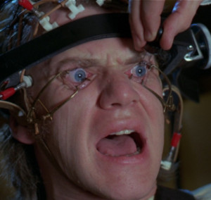
Clockwork'71
“HOW CAN WE MAKE PEOPLE WATCH OUR ADS?”

One of the most unintentionally hilarious questions in this Age of Data Mining must be, “Would you like to see more ads about this product?”

I wonder, does anybody actually click “Yes”?

Ironically, the thing that initially got me interested in a career in advertising was the very first thing out of the mouth of my mentor at Art Center, Ray Engle, “All advertising is an interruption.”

Nobody likes to be interrupted:

Nobody likes to have a TV show broken into with some non-sequitur thought about reverse mortgages.

Nobody likes to be called out of the blue by somebody trying to sell them something (especially the phone calls that begin with the blatant lie, “This is not a solicitation.”)

Nobody likes clicking on a YouTube video only to have to wait for 30 seconds through a commercial.

Nobody likes having pop-up windows get between them and the article they’re trying to read.

Nobody likes having to clean out their mailbox (literal or digital) of the 99% of the crap that’s cluttering it up.

And nobody likes to have their smartphone constantly vibrating with ad-mails and ad-texts (well…depending on where they carry their phones…almost nobody).

When you interrupt somebody, especially with an ad, you’ve already put them in a foul mood. Not the greatest state in which to sell them something.

And that’s why everybody hates ads. The only people who seem to like them are those that make them. And they only like the ones they make. Or the funny ones.

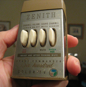
That’s also why there are spam filters. And that’s why there are DVRs, so you can FF through all the ads. And there have been “MUTE” buttons on TV remote controls ever the advent of the first Zenith Space Commander sixty years ago, which predated the creative revolution in advertising by six years.

Zenith_Space_Commander_600
THAT THIRD BUTTON WAS MY GRANDFATHER’S FAVORITE.

It used to be, back in the Mad Men Golden Age of advertising, that advertisers recognized this timeless fact about human nature;  people don’t like ads. This recognition was first uttered (supposedly) by David Ogilvy, “Nobody ever bored their customers into buying their product.” But for some reason, the majority of people making ads today seem to think that human nature has changed in recent generations and that people nowadays seem to love to be interrupted by ads. And bored into buying products.

I’m not a scientist, but…

Now, I’m not a behavioral scientist (even with my degree in it) and I haven’t actually read any studies to the contrary, but it seems to me that people still don’t like being interrupted. That hasn’t changed. That app is still working in Human Brain OS 1.0.

So, what’s an advertiser to do? What’s the anti-anti-spam technology? According to my first ad mentors, Ray Engle and Lee Clow, and to countless other genii of the Golden Age, the answer was simple: Make it good. You just pissed somebody off by interrupting them–you can’t get around that–so you’d better make it worth it. And “worth it” doesn’t mean telling us about all of your J.D. Power Awards.

The “worth it” is where creativity in marketing comes in. Make it entertaining. That was the giant, forehead-slapping discovery made by Ogilvy and Bill Bernbach and all the ad people who weren’t working at that hack-factory, the Sterling Cooper Agency, in 1962. Why are funny ads ten times more successful than information-only ads? (There actually have been studies to measure this.) Because they reward us for listening. They respect us as intelligent people. They know they just interrupted us. So they give us a peace offering.

And then we are not so inclined to hit mute, or change the channel,  turn off the TV, or click “skip” on the pop-up window.

Want to make somebody watch your ad? Then make them laugh. Or cry. Or scared. Or at least feel entertained. Other than kidnapping them, duct taping them to a chair, and clamping their eyelids open, there’s no other way to do it. Legally anyway.

When “Awesome” is.

Pillars of Creation 2014
WORDS FAIL.

I’m certainly not the first to complain about hyperbolic marketing language. The word “awesome”, for instance, which has come to be almost a place-holder adjective for everything from a new shade of nail polish to the Big Bang. To me, it’s like fingernails raking across my eyeball (you thought I was going to say “blackboard” didn’t you?). I hate it that much.  And while I’ve already ranted on lazy writing in this vein, that was almost two years ago, the earth has traveled some 2.8 billion miles in its orbit around the galaxy since then. I need to reiterate:

Put. The. Awesome. Down.

What happens with this relentless and unimaginative hypersuperlativation of language is that when we look at an image like the one above, the Pillars of Creation in the Eagle Nebula M16 (taken this week by the Hubble Space Telescope’s new hi-res camera), we are at a loss for words. “Awesome” is already dialed to 10 and we have nowhere else to go.

Let me give you some perspective. See that left hand cloud in the picture above? It’s approximately 4 light years long. That’s the same distance out to Alpha Centauri, our nearest star. In the hi-res version of this image (which I highly recommend you download) our entire solar system, five billion miles wide,  would fit into a single pixel, comfortably. This nebula is 6,500 light years away, which means we’re looking at something as it existed in 4,500 BCE, before Stonehenge, before the Pyramids, 1,200 years before the first writing.  Because it took light that long to reach us. And you know what else? This truly awesome nebula doesn’t exist any more. Astronomers calculate that this entire, incomprehensively gigantic structure will have been blown away by a supernova about 5,500 years ago. We just won’t see it for another 1,000 years.

Now don’t you feel puny?

But wait, there’s more: As awesomely awesome as the Pillars are, when compared to our Milky Way galaxy in which it used to exist (diameter 100,000 LY)  the entire nebula wouldn’t even be a pixel on an image of that. And the Milky Way is itself half the size of the Andromeda galaxy (M31) which is heading right for us. Might want to hang on to something in 3.25 billion years or so when the two collide. I could go on, but then I’d have to invoke the Monty Python Galaxy Song.

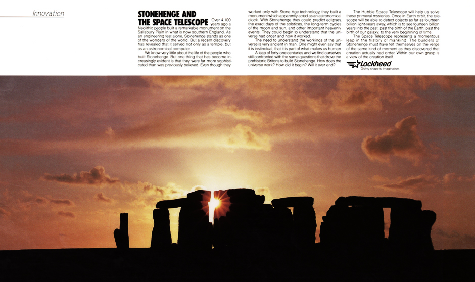
I have a personal, nostalgic stake in this, though. Twenty-six years ago I did an advocacy ad for Lockheed (see  below) urging Congress to keep funding the Hubble, which hadn’t been launched yet. Congress did. I like to think it was thanks to the awesome power of my persuasiveness. And Hubble went into orbit the following year. But just weeks before it went up, I got to go up to Sunnyvale in the Bay Area to actually see it in person. And looking down on that thermos-shaped school bus from the visitors’ gallery, a thrill went up my spine. We were about to see things we had never seen, at scales we couldn’t even comprehend.

That. Was. Awesome.

08 Stonehenge
The advocacy ad I did for Lockheed to persuade Congress to keep funding the Hubble Space Telescope.


Simple, Stupid

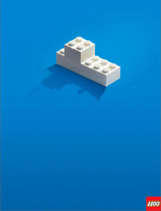
Lego periscopeThe Fifth Unbreakable Rule is Simplicity. And I wanted to take the time to celebrate some examples of extremely simple campaigns and individual ads that illustrate this principle elegantly. I know that most of my posts are sarcastic and negative–mostly because that’s what entertains people. But I’m obeying a court order that requires me to do a positive post occasionally to balance out all the negativism.

Many of you, especially in the creative side of the ad business, have probably already seen these two print campaigns for Lego. The first is so simple and yet so eloquent in the ultimate benefit of the product that it literally needs no words. So I won’t use any.

Lego shipenhanced-buzz-31915-1355155782-17enhanced-buzz-7046-1355155883-0

enhanced-buzz-31955-1355155876-6


The second campaign, done a couple of years ago by Leo Burnett in Moscow, is equally simple and just as emotionally evocative. It shows the cover of the kit box in a small inset—what the Lego kit is intended to build—but the main image shows what else you could do with it. I can’t imagine a toy from Mattel giving the purchaser such license; “No, this is how it’s supposed to look, so don’t dare try anything creative.”

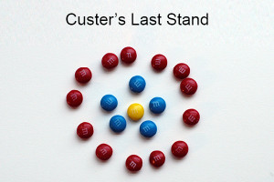
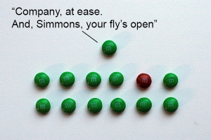
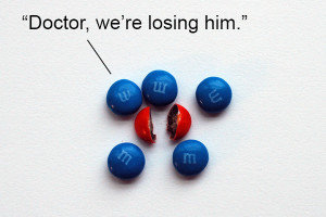
enhanced-buzz-wide-17628-1355154796-6enhanced-buzz-wide-24415-1355154918-8enhanced-buzz-wide-24986-1355154900-19It brings back my own childhood, when I used to use Lego blocks to build all sorts of ships, submarines, siege engines, castles, forts, particle accelerators, lunar landers, and time machines. My imagination was so febrile I’d use a ball point pen to stand in for a spaceship (especially if I were trapped in the back of my parents’ Chevy without toys). And once I used a bag of M&Ms to make jokes for my family  (see a lifelike re-creation of some of them below). Simplicity is the essence of creativity.

All these Lego campaigns use no copy and juxtapose two simple images to convey an emotional and evocative concept; that there is no limit to your child’s creativity and imagination. Lego’s brand has, for generations, stood for making a child’s mind the whole point. In an age when so many toy and game companies have designed out the imagination part—e.g. toy cars that make the “vrroooom vrrooomm” sound effect for you—Lego has managed to resist that (pretty much). It’s all about creativity; from its products back down to its very ads.

These two campaigns demonstrate the virtue of simplicity. But they also obey all the Nine Unbreakable Rules of Marketing: They’re consistent with Lego’s brand (Rule 1). They cultivate the perception of the audience of Lego as a wholesome, creative toy (Rule 2). They are very creative (Rule 3). They have a strong message which would ring through any medium (Rule 4). They give love in that they are highly entertaining and entice the viewer to use their own imagination (Rule 6). They are emotional in that they make us think back on our own childhood, and how much fun it is to just play (Rule 7). They go big in their luxurious use of space and confidence (Rule 8). And, finally, they recognize that the end use of their product is itself part of the marketing; that everything is marketing (Rule 9).

Navy SEALs Footsteps Spot

And then, another one of my all time favorite “simple” ads is this one from a couple of years ago for the Navy SEALs done by Campbell-Ewald in Detroit. Again, no words at all except for the URL at the end. It doesn’t need words to be creative or effective. It reinforces the brand, and also appeals to the kind of person who aspires to be the kind of baddass that can sneak ashore in the dead of night. They’ll never hear you coming.

navy-seals-footprints
Click to play


And Now, for Some Stupid Simplicity

Okay, I’ve fulfilled the positive side of this post by praising some ads for their simplicity. Now I get to be negative again. Which is always more entertaining, isn’t it?

Dumb Toaster
Click to play

This isn’t an ad campaign, but it is an example of dumb design. The concept of the flaw is itself so simple that it only takes a second to communicate. And you can see how, though unintentional, a simple, funny boo boo can become so viral. Just look at the number of shares on this fail video (almost 2 million at this post). The toaster design is dumb. But the creativity of the post itself is so simple and effective. That’s why it went viral. So, at the expense of a bad design, which is itself the source of hilarious entertainment,  a simple message finds wings.

Appendix: My Childhood M&M Jokes

I love appendices in books. They always seem like bonus materials to me. So who says you can’t add them to blog posts?

Here, as promised, are three of the M&M jokes I can remember creating from  my childhood. M&Ms are a great tool of creative fun, besides being a balanced source of wholesome nutrition. I think it was as far back as this early age when I thought I would love to go into advertising; thinking up dumb captions for clusters of branded candy.

MM Custer

MM flys openMM Surgery

Avis decides trying harder is just too hard

Avis girl
I know how this actress must feel being in this goddawful commercial.

What the hell happened to Avis? Oh, yeah, they got a new ad agency. And what’s every lumbering, Cretaceous-era ad agency’s mantra? If you get a new client, take everything they’ve ever done and lift your leg on it.

As every sentient being on this small, rocky planet orbiting a third-rate star must be aware, for the past fifty years  Avis’s brand position and slogan has been “We try harder.” One of the classic and most effective brand positions ever. First conceived at Doyle Dane Bernbach back when Kennedy was president, it has stood as a powerful brand message ever since. Timeless. Inspiring. Memorable. Self-sustaining. And brilliant. It stands for perpetual improvement, a hunger to get better, and making the customer first.

Enter the Keebler Elves

Now along comes a new ad agency for Avis, Leo Burnett (of Tony the Tiger, Jolly Green Giant, Keebler Elves, and Pillsbury Doughboy infame), who felt the need to chuck all that and come up with perhaps the dullest, most banal ad campaign so far this year. They’ve also added insult to injury by flushing Avis’s stalwart “We try harder” in favor of some focus-group-generated, lifeless tagline and a derivative concept that seems to come right out of Don Draper’s hackneyed, martini-soaked, Sans-a-Belt slacks.

This campaign, “The Professionals,” is part of a new (and I use that adjective with extreme irony) brand proposition called “It’s your space.” Of course, it’s just a humiliating attempt to imitate National Car Rental’s “Rent like a pro” campaign. Because National has been stealing Avis’s lunch money and dunking their heads in the toilet for years now, some marketing MBA at Burnett probably thought it would be just the ticket to emulate those bullies. That’s how you make yourself unique; remind your customers of the other guys.

The concept is pathetic on the surface. And in execution it’s even worse. Like you’d expect from every other bloated, obsolete ad agency, Burnett’s creative teams had the original idea of paying celebrities (but in this case, third-level celebrities) to shill their client’s product. I’ll bet that was a late-night, white-board session.  So the message is, if you’re a celebrity, Avis treats you like a celebrity.

Everybody in the commercials just looks bored to be there. And the jokes are so limp they would make a minivan full of preschoolers groan. (A Playboy centerfold/volleyball player says she’s going to slip into this “tight black number I brought with me,” but it turns out to be just her yoga leotard. Get it? Get it? Because you thought it was going to be a…oh, never mind.)

They even have the gall to post a “behind the scenes” video on Avis’s website, just in case you were curious to see what it might have been like to stand around all day, pigging out at the craft services table, and shoot this steaming mountain of Triceratops dung. What’s so great about this BTS video is that it’s message is, when you’re a near-celebrity, you really need to retreat to luxury (“your space”) to get away from all those sweaty little people who can be so annoying.

Back when advertising was creative, Avis used to do spots that amused, but, more important, identified with us, the “sweaty little people”. They told us they had to try harder to earn our loyalty. Now, of course, their message (at least from these ads)  is they would prefer not to have to deal with us at all.

Here’s a strong brand. Let’s kill it.

But the unbelievable and heartbreaking thing about what they’ve done is the cavalier dismissal of one of the strongest, tallest, oldest brand positions in the history of the world. Rather than seeing how they could creatively refresh and remind us what trying harder means, they’ve decided to not try at all and apply an advertising formula from 1959…and saw down this Sequoia of a brand.

But that’s what obese, senile ad agencies do: Kill brands.

jeannine-haas
Avis’s new CMO Jeannine Haas

Avis’s new, Gen-X CMO, Jeannine Hass–whose first act was to fire incumbent and longtime AOR McCann Erickson (as every new CMO must do to show everybody who’s boss)–explained her reasoning in dumping the brand position that has worked longer than she’s been alive, “Consumer-centric brands must always evolve in order to keep pace with ever-changing customer needs and preferences. Avis is evolving as a premium brand to better meet those needs.”* Inspiring words; right out of a Douglas Adams satire. One can see where “We try harder” doesn’t cut the butter where “ever-changing customer needs” are concerned. The new customers don’t want a rental car company that tries harder. They want a rental car company that gives them their own space…man.

Haas backtracked a little, though, when she said, “We firmly believe that after nearly five decades, ‘We Try Harder’ is fully embedded in the Avis DNA, and defines the spirit our employees embody to deliver superior customer service.” Yes, so let’s shitcan it. And, yes, she actually used the phrase, “embedded in the Avis DNA.”

Good luck, Avis, with your new marketing officer and your new agency. Don’t stop trying. I’ll still rent cars from you, even if your advertising sucks.

And if a headhunter approaches me about a sweet job at Avis or Burnett, this post never existed.

*From AdAge 27 Aug 1012 article: http://adage.com/article/news/50-years-avis-drops-iconic-harder-tagline/236887/

WINDOWS OF PERCEPTION

iPhone 5I couldn’t help noticing the new iPhone 5 commercial from TBWA/Chiat/Day. It features a montage of pretty, young people taking pictures of all kinds of pretty things with their iPhones. Very pretty. Lots of appetite appeal (as we say in the biz). Lot’s of demonstrations of zooming, and cropping, and panorama-inginging-ing. It’s accompanied by pretty piano music with a simple chord and beat, like you’d expect from Chiat/Day and Apple. Very pretty. Altogether it is a quintessential example of clean, simple advertising.

Years ago, when I was going to Art Center to learn how to be an ad creative,  I was fortunate to take a rare class from Chiat/Day legend Lee Clow. (As far as I know, it was the only class he ever taught there…and with good reason.) Clow was the CD behind the historic “1984” Macintosh ad. He inspired us to keep things simple, to go for the heart, and to make things elegant. You can certainly see his influence in this new iPhone ad. He was one of the main reasons I decided to make a living in advertising…instead of neuro-ophthalmology.

The only copy in the ad is also simple, coming at the end where a voice over announcer says, “Every day, more photos are taken with the iPhone than with any other camera.” Very strong. Very simple. Very Clowesque.

Only it’s a fairly outrageous statement. Is it true? Are more photos taken with an iPhone than any other camera? With the Apple iOS continuing to lose market share to Android-based mobile OS, you have to ask yourself.

According to industry reports, last year Apple iOS had fallen to less than 20% global market share to Android’s 70%. And in an article in Fortune this week, iPhone is projected to drop to 9% from a high of 22% just six months ago. So either iPhone owners are taking pictures much more frequently than anyone else (like Samsung Galaxy III owners, or Canon or Nikon owners) or it’s just…oh, what’s the nice word for it? You know; when someone represents something that is different from reality. It’ll come to me.

I think, listening to my friends who are loyal Apple owners (whether Mac, iPhone, iPad, iPod), that they are so in love with the brand and the product that they must believe that the whole world is pretty much Apple-based now. Why else would you have any other brand? Apple is frequently reported in the press as being the world’s largest company (at least in terms of market cap), even though it’s a long way from being the actual largest company, too (see Fortune’s list of Fortune 500). So doesn’t that mean that more people have iPhones, iPads, and Macs than any other similar appliance?

Nope.

I was looking at the stats on a client’s website yesterday and a curious datum hit me: Under “Page Views by Operating System” 72% were from Windows OS (which would include everything from Windows 8 back to, I guess, Windows 95), but just 7% were from Mac OS (it didn’t parse out the versions). If you add the mobile iOS , the total Apple share of this activity was less than 19%.  The balance was from Linux and Android.

I was surprised. This doesn’t seem like the world’s largest company. These numbers seem about consistent with Apple’s market share 20 years ago.  Not a whole lot of movement in the 29 years since Mac was introduced in 1984. By the end of that decade, Mac penetration into the personal computer market was also in the single digits. Like today.

In an article from last fall, ZDNet’s tech reporter Adrian Kingsley-Hughes headlines: “Mac OS X Overtakes Windows Vista in Global Market Share.”  The numbers don’t lie:  a whopping 7.13% for Mac to a pathetic 6.15% for Vista (never popular to begin with and by last year already on its way out). Further down in the article (you’ll notice, with a hilarious graph) he concedes that total Windows share has been unchanged for years at 92% to Mac OS X’s  7%.

So how can more people be taking pictures with an iPhone? And Apple be the largest company on earth? And everyone be using a Mac? It certainly seems that way whenever you go into a Starbucks and try to find an open table without that bitten apple staring at you.

Perception is Reality

This is Rule #2 of the Unbreakable Rules of Marketing. And Apple really does a bang-up job obeying it. Their ads, their brand, even their loyal customer base, all speak with one voice to control and cultivate that perception. There is only one choice in terms of computers, smartphones, tablets, and media players; and it’s Apple. So the iPhone ad can confidently state that more people take pictures with an iPhone than with any other camera, and nobody’s going to question it. It sure seems that way; so it must be true. The perfect sophistry.

Apple has done such a good job at synonymizing the iPhone with smartphones in general that when we see crowds of people holding up their little rectangles to take a picture at an event, we all assume they’re holding up iPhones. It’s hard to tell a Samsung from an iPhone at that distance, anyway. If we see someone using a tablet in public, we also assume it’s an iPad. In fact, no one uses the generics “smartphone” or “tablet” to describe these things; they’re iPhones and iPads. They’ve become the Kleenex®, Bandaid®, Aspirin®, Xerox®, and Coke® of electronics…without the ®s. That’s brand nirvana (except to the trademark attorneys).

Will anyone stand up for Windows? Anyone?

Of course, no one’s going to challenge Apple’s claims of brand superiority. You don’t have loyal gangs of Windows users coming to the defense of Microsoft. People who use Windows (including me), don’t feel particularly religious about it. It’s pretty much a generic when it comes to operating systems, even though each iteration does pretty much the same thing each new generation of Mac OS X does. But we’re not going to leap at the throat of someone who complains about Windows. Try criticizing a Mac or an iPad to an owner, though.  Those people are fanatics. (I can’t wait for the reaction to this post.)

It’s not because Apple products are so much better. It’s because Apple branding is. Just look at its market cap (#1 at $500 billion) versus its actual size (#55 at $108 billion). Apparently, people are five times more likely to buy Apple stock than Apple products.

Steve Jobs has been described as a visionary, a genius, an inspiration to all who seek to create heaven on earth. Of course, none of the innovations with which he is credited did he actually come up with first; the personal computer, the WYSIWIG graphical interface, the laptop, the smartphone, the tablet, the touchscreen interface were all developed by other people at other companies before his muse visited him. What he was a genius at, and what Apple continues to excel at, is brand marketing.  Nobody does it better.

Okay now, Apple owners. Bring it on.

The Oddest Spot of 2013

Gain revolving door
We may be in here a while. How does he taste?

I’m still having a hard time believing this Procter & Gamble Gain commercial is real. Or that it isn’t some satire of the old Brand X comparison concept of the ‘sixties.

It starts off with an oddly framed shot of two people in a laundromat; in which the Gain-using man’s arm is inexplicably foreshortened to make him look deformed. It took a couple viewings to ascertain that he wasn’t an amputee.

But then the most ridiculous comparison is made: A distinctly soporific voice-over claims that  “a single scoop of Gain gives more freshness  than a whole box of this other stuff.” The “other stuff” clearly being an ill-disguised Arm & Hammer, which is also shown as half the size of the Gain box.

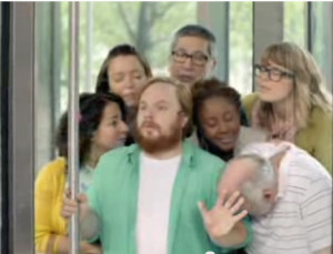
They never define what they mean by “freshness”. But as the spot unfolds, you get the idea that it means perfumes because the man gets trapped in a revolving door with several other people and they start sniffing him with expressions of rapture on their faces. Clearly he smells good? I guess?

Now, the idea of being trapped in a revolving door with a crowd of people all sniffing me is not my first idea of bliss. Could they be thinking, “we may be trapped in here awhile and we need to think about who we’re going to eat.”? So it was definitely an odd demonstration.

I’m sure they thought it was creative. But the analogy I got was, using Gain is about as much fun as being trapped in a tiny space with carnivorous zombies.

At the end of the spot, a hero shot comes up and the soporific voice delivers the product promise, “Get more freshness from Gain. Or get your money back. Guaranteed.”

More freshness than what? Does this mean that if I can prove there is not as much “freshness” in their box as they claim, I get a refund? How would I prove that? What do they mean by “freshness”? Is there a freshness scale? Can you run it through a mass-spectrometer or a freshometer to calibrate the freshness?

And “Guaranteed?” A guarantee of squat.

Of course, all this spot did for me was to remind me why our family uses Arm & Hammer to begin with; precisely because it’s free of perfumes and dyes. So thanks, Gain, for reaffirming our brand choice.

Talk about emotional

Sprint girl screen shot baby
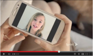
Leo Burnett’s “Girl” spot for Sprint

I know it seems like all I do is bitch and grouse and criticize about what people do wrong in marketing. At least that’s what my daughter thinks I do. But I wanted to bring this spot to everyone’s attention. It’s a simple commercial from Sprint that started airing last fall. And I saw it again tonight. The concept is so simple and so beautiful, and being the father of a little baby who’s all grown up, emotionally knee-weakening.

Done by Leo Burnett, it features a “time lapse” of a little girl growing up before your eyes, all on a smart phone. The message is the longevity of Sprint’s service with the Samsung Galaxy SIII smartphone and its unlimited text and data. A hand touches one phone to another, transferSprint girl screen shot 2ring the images of the talking girl instantly from one person to the next, as she grows older by the second. To me the gesture is so perfect, and reinforced by the poignant soundtrack of Alexi Murdoch’s “All My Days”. I was a goner. And if I weren’t so hip deep in my contract with AT&T (curse them!) I’d definitely reconsider Sprint. I may still.

I’m going out on an uncool limb here and state that it’s a great and memorable ad, obeying all of the 9 Unbreakable Rules of Marketing. But especially #3 Creativity, #5 Simplicity and #7 Emotionality.

But that’s just my empty-nester opinion.